Showing posts with label Research and planning. Show all posts

Sunday, 5 March 2017

Shooting Schedule


Shooting Schedule                                     Location                                         Time 

  • Filming Choruses                             Gallery                                           11:25-1:30
  • Neon signs                                        Gods own junkyard                       4:00-6:00
  • filming begging video                       Erith pier                                       11:25-1:30
  • Journey                                              London tube                                  11:25-1:30

Music video director

Hiro Murai-

Murai is known for his own distinctive style as he always manages to add unique twists on all his pieces of work. His twists are usually incorporated with a variety of special effects, there is normally some sort of supernatural creature involved. In Childish Gambinos- Telegraph Ave the video is focused on the artist Gambino having an exotic holiday with his girlfriend (Jhene Aiko) however towards the end of the video Gambino transforms into some monstrous creature. He has mentioned that he loves to leave twists as he likes to shock the viewers thinking the video would end in 'happy endings'.

I really enjoy Marui's videos as they always have a cinematic feel towards them as he uses multiple shots such as this birds eye view. His videos also have rich deep colours in which are visually pleasing.


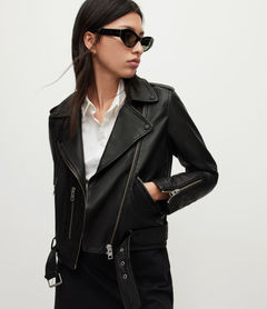
Artists costume

In the indie pop genre the artist represents themselves in the clothes they wear. Because they are contracted to a independent label they are free on how they want to represent themselves without no boundaries.
Many indie pop artists dress quite 'edgy' or just dress in neutral colours. Our artist will be dressing in clothes that represent her and her characteristics.

Related imageImage result for leather jacket for women

Image result for white jumper womensImage result for chelsea boots for women


Music video analysis

Wet-Deadwater

Many conventional indie pop music videos use coloured lights in low key lighting to convey how they feel or just the idea of it looking visually pleasing.


This is a handheld establishing shot, these are very common in this genre as it has the affect of the audience feeling like they are in the moment. This establishing shot looks like quite vintage with the colour being quite brown and green this was probably done in editing changing the colour grading to get a more of a vintage cinematic feel.


In indie pop music videos the artist usually relates to their audience through clothes. The artist here is doing exactly that as shes wearing the classic mum jeans and a plain white jumper which colours go nicely. Costumes are important as it represents the artist and reflects on what their audiences wear.


Close ups of the artists lip syncing is common as shows emotion on what the artist is syncing.


Music video analysis

Broods-Bridges

In indie pop music videos theres a set of codes and conventions they follow to fit into this particular genre.  In this scene we see a medium close up of the two protagonists in the video with the way they are behaving suggests they are in a relationship or in some sort of unrequited love situation. This is a very common narrative in this genre.
The outfits they are wearing also fit in with the genre as they are dressed in vintage 'edgy' clothing, this could help link to the audience as they would feel like they could see themselves in this sort of outfit.

Here this scene is done by handheld which is brings a 'homemade' kinds of feel towards the video. This is very common in indie pop videos as artists want to convey a video which can relate to a audience and make them feel a part of the experience.


This shot is visually pleasing as you can see contrasting colours with the red they are wearing and red on the hut they are sitting on. The location of this shot suggests they are living in a estate this also gets the audience involved making everyday places seem visually aesthetic.


The colours in this shot compliment each other as the blue seats and red jackets are primary colours.  They stand out as the background colours are neutral.


Indie pop music videos conventionally use establishing shots to create a sense on where the video it taking place or where artist it. Establishing shots are also used to create make the video more visual pleasing towards to the viewers.


Record Labels

Major labels are powerful and known to the rule the music industry. They manufacture , distribute and promote the music of the people under contract. An example of a major company would be EMI, major labels are usually owned by a parent company EMI parent company is the Universal music group.
The is different from independent companies as they do not have a corporate backer. An example of a independent label would be PWL.

Major label 
The contracts that the artists sign are usually very strict and often take control on what music they produce and how they promote themselves on the media. Major labels also wont let artists keep the rights to their music so they are restricted on how they can spread their music the way they want.
Most major record label artists earn 10%-15% royalty on their music. This just shows that labels only really care about income and not the actual artist.

Independent label
Independent labels usually contract with indie and alternative artists. The artists have a huge benefit that a major label does not, artists are able to the keep the rights to their music meaning they can use it for what they want; selling it to advertisements, films, television or any other products they wish. They are also in control with how they promote themselves as an artist meaning they have no restriction on they way they dress and the music they make. This just shows how much independent is more beneficial for independent.
An independent label maybe more appealing as they get about 40%-75% in royalty.
Independent also have a much more close relationship with their fans as they want fans to enjoy their music as well as them, presenting themselves as humble and grateful for their fans and willing to give back.

Music video analysis

In the 1975s music video Chocolate it is black and white throughout, this pretty conventional in a indie music video. The lyrics of the song are about drugs which is common theme in this sort of genre. The music video features a women in a variety of sexual scenes this isn't very common in indie pop music videos. The atmosphere is quite laid back and carefree which could be connoting the use of drugs and the effects it has. A band performance is pretty conventional in a this genre so we see the band performing in a run down places such as a warehouse this adds to the whole edgy and mysterious vibe of the video.

As the main singer seems to be the face of the band as all the main close ups are of him this is also occurs in their previous music videos. The main close ups connotes that this is the artist the audience associate themselves with Matt ( lead singer ).


Wet- research

Wet's self-titled debut EP, released last October on Neon Gold Records, has sold 1,000 copies to date, according to Nielsen SoundScan. But several figures within the music industry seem to think that Wet's first release is the first precursor to something much bigger. The songs that Wet has released thus far are all "breakup songs, at least superficially," says Zutrau, but that won't be the case forever. The threesome has been practicing and recording all day in Brooklyn -- preparing for the many live shows and debut album that will both inevitably come -- and then crashing hard at night. "It's exhausting," says Valle, "and so much fun at the same time."  The three members of Wet met while Sulkow and Valle attended NYU and Zutrau was a student at Cooper Union in New York, and the trio began making music casually. When Zutrau moved to Providence to attend the Rhode Island School of Design and Valle headed to Los Angeles for a brief period, the three continued to email each other unfinished tracks, and when they reconvened in New York in mid-2012, passing songs back and forth turned into seriously focusing on a handful of tracks.
Image result for wet bandRelated image

Wet

We have all decided to go with the indie pop song called Its all in vain by Wet. As a group we had a much more clearer vision on what we would want the music video to look like for this song.

Songs

After a extensive time of researching of different genre of songs we narrowed it down to these three.


Saturday, 4 March 2017

Fonts

We have been researching different fonts for our artist using sites such as dafonts, we narrowed it down to these three but it still felt like they represent our artists so we have started looking again for a font that represents our artist.


Editing styles

Editing in indie pop videos usually match the pace of the song, fast cutting can emphasize the fun and energy the artist wants to purvey, However slow paced songs will have slow pace cuts and transitions to show the emotion they are displaying also when editing its important that the cuts match with the beat. The editing in Lana Del Reys- Born to die uses long takes as it as the song has a slow tempo if this video has fast takes it would look and feel out of place. The viewers also wouldn't be able to connect with the song visually. 


Shots

Shots

Establishing shots are used conventionally in indie pop music videos as it can create significant meaning or can shows where the artist is. Some artists use establishing shots just for the aesthetic it creates. For an example Symbion project- Arcadain uses multiple establishing shots of the location they are at but it also looks visually pleasing to the viewers.


Shot types

Shot types

The type of shots in indie pop videos are usually just standard close ups, establishing and mid shots.
For an example a close up in Bastille-Pompeii is to show the audience to view his emotions and allowing them to emphasize with him. Indie pop videos conventionally show lip syncing which can also show emotion on what the artist is feeling on the way they perform.
Image result for bastille close up pompeii

Lighting-Colour

In the Indie pop band 1975- Somebody else, the throughout the music video there is low key lighting and high key lighting from the tunnel light but it still is dark around him which makes everything dull and gloomy. There's also some colour in parts of the video such as red, this colour may link to the video as it represents love and lust as its a very emotionally intense colour.


Lighting-Colour

Lighting plays a big part in indie pop music videos as it can create shadows, blocking out the background and or hiding certain parts of the artists face to create a more edgy and mysterious vibe.
The colours usually in indie pop music videos are dark pastel colours such as brown and other earthy tones.
An example is twenty one pilots- heathens. The lighting is mainly low key but some are high key to create strong shadows. Using low key lighting reflects on the mood and atmosphere of the video, as it is set in a prison we automatically sense the mood and would seem a bit odd using high key lighting and bright colours in a prison space.
Image result for twenty one pilot heathens

Narrative

Watching and researching different indie pop music videos i noticed that they don't really use strong story lines but have a much broader theme linking with being isolated, not being included in society or something to do with relationships.
I have also noticed that they tend to create aesthetic visuals.


Indie Pop- Artists

Lana Del Ray-

The front cover displays a simple medium close up of Lanas face, upper body and costume. The simplicity of the design allows us as the audience to focus on Lanas vintage style and character.
Because Lana is directly in the middle it allows the audience to be drawn to her beauty. Creating a visual characteristic of the artists is well known in the indie pop genre as it allows the artist to represent them as themselves and something there not. The image of  Lana has her directly addressing the camera and audience with her in the foreground, centered within an outdoor location that is minimal and simple putting main attention onto her.
The colours are also quite neutral with her name as the title and the album name smaller the colours go well together because of how the background colours all connect with another.

The theme continues inside the panels through mise en scene. With two images spreading across the panels showing a classic vintage representation of Lana as she continues this placid and innocent expression. The artwork doesn't really link with or tell a narrative with the album name 'born to die' its really just showing the artists style and character.
The colours throughout the panels and covers all complement each other. The red from her hair and lips could connote love,lust and passion which could link to what the album is about.

The CD features a white background surrounded by red roses although there is no text it is apparent that it relates back to the title of the album as it is conmon to use roses at funerals 'Born to die' The colours red and white are constant throughout the digipak which creates a nice theme. The text used for the track listing is the same font as the title and Lana's name which makes it recognizable to the audience giving them a branded font associated with Lana Del Rey
Image result for lana del rey digipak born to die


Indie Pop - Artists


Florence and the machine-  

Related image
The name of the band is in bold writing so it captures the viewers attention.The font is well recognized as its the same font they use to sell themselves such as merchandise, album art and websites. The black border emphasizing the album art its also creates a 'classic' look.

One of the artists signature icons are 'birds' and 'birdcages' which is including in the album art this may connect with fans as they recognize this. The colours in the photograph are quite neutral but with some bolder colours to accent the important things such as her signature red hair and the lungs which represent the name of the album. some may find this disturbing with the rich red colour contrasting with the blues and yellows. 

Image result for Florence and the Machine lungs back cover
The anatomical drawing of the human lungs are the first thing that catches your eyes, matching the album name 'lungs'. The classic black and white theme matches the border and font on the front cover. 


Location- Chorus

For our chorus we need to be filming on a plain white wall as we are having multi-coloured lights reflecting on our artist. Our location for this was the gallery in our school as we needed it to be dark as possible for the lights to work.