When researching we came across many famous logos which could be easily recognizable from everyone. I noticed that most logos where very minimalist and were mostly black and white. For an example Artic Monkeys logo is a very simple and classic method of design using simple colours and shapes. Their logo is instantly recognizable and its works with their whole suited up and edgy look.
Although using black and white is the classic way many artists want to throw in a array of colours,shapes and other figures. When using colour you have to choose wisely many say its better to stick to neutrals. But you have to remember that the logo represents the band or artist so you cannot be using loud colours that dont represent the band or music. Being subtle with colours also can make a huge impact .
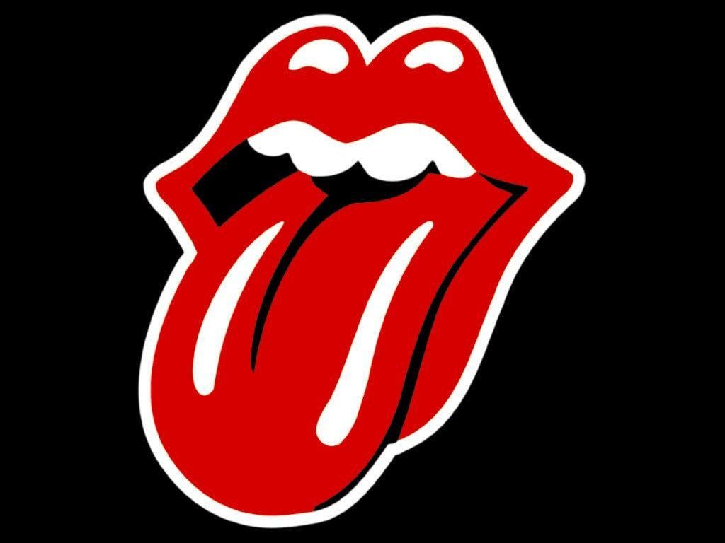
A lot of logos have two piece: one is the entire logo, and the second is an icon that can be used by itself. For instance the Rolling Stones tongue can be put anywhere by itself and be instantly recognized by everyone.
No comments:
Post a Comment